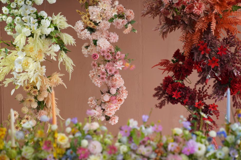
Guide to matching seasonal blooms to UK colour palettes
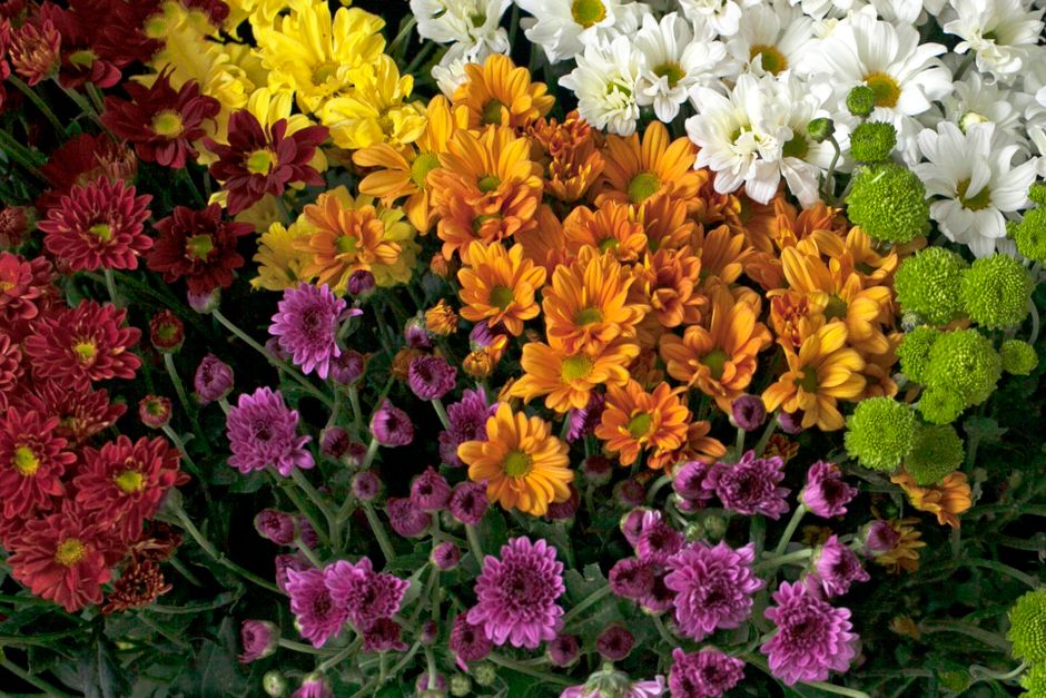
Choosing flowers is rarely just about the flowers. In the UK, it is often about the feeling you want the room, bouquet, or table to give off once the light hits it, once the candles are lit, once the parcel is opened on a rainy Tuesday afternoon. That is where a thoughtful Guide to matching seasonal blooms to UK colour palettes really helps. It gives you a simple way to pair what is naturally available with the tones you actually want: soft and romantic, crisp and modern, warm and autumnal, or bright and joyful.
To be fair, this can get fiddly if you are planning a wedding, a corporate event, a gift, or even just a dinner table that needs to look considered rather than accidental. Seasonal blooms change fast in the UK, and colour palettes behave differently depending on the month, the venue light, and whether you are leaning into British-grown flowers or mixing in imported stems. This guide walks through the whole thing clearly, without the fluff.
By the end, you will know how to match seasonal flowers to a colour palette, how to avoid clashing combinations, and how to make choices that look intentional rather than overworked. A bit of structure goes a long way here.
Why matching seasonal blooms to UK colour palettes matters
At a basic level, matching blooms to a colour palette helps flowers feel coherent. But in practice, it does much more than that. It makes arrangements easier to brief, easier to source, and usually more pleasing to the eye. When flowers are in season, they tend to have better form, better value, and better natural character. When the colour palette is in step with the season, the whole arrangement feels grounded instead of forced.
That matters in the UK because our floral expectations shift with the calendar. Spring in Britain often suggests freshness and movement. Summer leans fuller, brighter, a little more generous. Autumn gets richer and deeper. Winter asks for restraint, texture, and contrast. You can absolutely break those rules, of course. But if you understand them first, the result usually looks more confident.
It also matters for practicality. A florist sourcing for a March wedding in Yorkshire will not face the same palette choices as someone styling a late August event in London. The same is true for gift bouquets, venue flowers, or retail displays. Seasonal choice affects stock, stem quality, and how far you have to push a colour story to make it work.
Expert summary: the best floral colour schemes are rarely the loudest ones. They are the ones where the flowers, the season, and the setting seem to agree with one another.
There is another reason too: seasonal palette matching saves you from the common trap of overdesigning. You know the one. A bouquet that looks like it is trying very hard. Matching seasonally helps the design breathe.
How matching seasonal blooms to UK colour palettes works
The process is simpler than it sounds. You start with the palette, then look at what the season naturally offers, then shape the arrangement so the two support each other. That means thinking in layers: base colour, accent colour, texture, and mood.
In real terms, this usually means asking four questions:
- What is the core colour family I want: pastel, neutral, jewel, warm, cool, or mixed?
- What flowers are naturally at their best in this season in the UK?
- Which stems carry the main colour and which should play a supporting role?
- What does the setting need: softness, contrast, drama, or calm?
For example, a soft blush and sage palette in spring may suit tulips, ranunculus, anemones, and eucalyptus. A deep berry and ivory palette in autumn may work better with dahlias, roses, scabious, amaranthus, and textured foliage. The same logic applies whether you are building a hand-tied bouquet or a full venue design.
Think of flowers almost like music. The main blooms carry the melody, the supporting stems provide harmony, and the foliage keeps the whole thing from sounding flat. Slightly poetic, yes, but it is accurate enough.
The UK angle matters because local seasons do not always match imported availability. A palette that looks effortless in July may require more careful sourcing in January. So the design process often includes a reality check: can this palette be achieved naturally, or will it need substitutions? That question saves time and stress, both of which are in short supply during busy event weeks.
Key benefits and practical advantages
Matching seasonal blooms to colour palettes is not only about looks. It has practical, creative, and budget-friendly benefits too.
- More natural-looking arrangements: Seasonal blooms tend to suit the moment without looking strained or overworked.
- Better availability: You are more likely to find the right stems at the right quality, which makes planning calmer.
- Improved value: Working with seasonal stock often reduces the need for awkward substitutions.
- Stronger design consistency: Colour and form are easier to control when the flowers are already in tune with the time of year.
- Less visual conflict: Seasonal tones usually sit more comfortably with the light, weather, and venue atmosphere.
- Better sustainability choices: If you choose British-grown or seasonally suitable flowers where possible, the arrangement often feels more responsible as well as more beautiful.
In our experience, clients often notice the difference before they can explain it. They will say a bouquet feels "calmer" or "more finished", which is usually code for the palette and season are working together properly.
There is a commercial side too. If you are comparing floral options for an event, staying season-aligned can reduce the need for rushed sourcing. For practical budgeting, that can be useful when reading guides such as average flower delivery costs in the UK or looking at broader value comparisons like DIY bouquets versus professional delivery.
Who this is for and when it makes sense
This approach is useful for a wide range of people, and not just florists. If anything, it is most helpful when you are making a decision under pressure and need the flowers to look right first time.
- Wedding couples: especially if you want the bouquet, ceremony flowers, and tables to feel joined up rather than pieced together.
- Event planners: where room colour, branding, and guest experience all need to line up.
- Gift buyers: if you want a bouquet to feel personal, seasonal, and polished.
- Hospitality and office teams: when flower displays need to complement interiors without overpowering them.
- Home stylists: anyone building a tablescape, shelf display, or entryway arrangement with a clear colour theme.
It makes sense anytime the visual impact matters. That might be a spring lunch in a terraced house in Islington, a summer wedding marquee in Kent, or a winter reception desk that needs a lift on a grey morning. Flowers change the room, but only if they are chosen with intent.
It also makes sense if you are unsure where to start. A seasonal palette gives you a framework. That is often the difference between wandering around the flower market thinking "these are all lovely" and actually knowing what you need.
Step-by-step guidance
If you want a reliable method, use this straightforward process. It works for bouquets, venue florals, gift orders, and styling projects.
1. Decide the mood first
Before you think about individual blooms, decide how you want people to feel. Calm? Celebratory? Luxurious? Fresh? Romantic? Moody? If the mood is clear, the palette usually follows more naturally.
For example, a soft wedding mood may point you toward blush, cream, sage, and pale apricot. A more dramatic dinner setup may call for burgundy, rust, plum, dark green, and ivory for balance.
2. Pick a palette family
Choose a broad colour family rather than trying to lock in every tone too early. In the UK, the most useful families tend to be:
- pastel and blush
- white and green
- sunset tones
- jewel tones
- earthy neutrals
- bright mixed colours
This keeps the design flexible. A palette does not need to be rigid. In fact, rigid palettes can feel awkward when seasonal flowers are doing something slightly different.
3. Check what the season naturally offers
Look at the flowers that are strongest in that moment of the year. You do not need a botany degree. You need awareness.
Spring often brings tulips, ranunculus, narcissi, anemones, hyacinths, blossom, and fresh foliage.
Summer often leans into roses, peonies, delphiniums, sweet peas, hydrangeas, lisianthus, and early dahlias.
Autumn usually offers dahlias, chrysanthemums, amaranthus, sedum, berries, and richer foliage tones.
Winter tends to favour amaryllis, hellebores, anemones, winter roses, berries, evergreens, and sculptural stems.
You may also find that some flowers are available outside their classic season, but not always in the same quality, colour range, or price band. That is worth keeping in mind.
4. Match main colours to hero blooms
Place your strongest colour in the most visible flower. If your palette is blush and ivory, let the hero flower carry that softness. If the palette is plum and rust, choose blooms with deeper pigment and let pale elements support rather than dominate.
One mistake people make is trying to force every flower to carry equal weight. That usually muddies the arrangement. Better to give the eye a clear lead.
5. Use foliage and neutrals to connect the palette
Greenery, cream, wheat tones, dried textures, and muted fillers are the glue. They help the palette breathe and stop the arrangement from becoming one flat block of colour. This is especially useful in the UK, where natural daylight can make some colours look cooler or flatter than expected.
6. Test against the setting
Look at the venue or room. White walls, dark wood, brass details, linen napkins, patterned wallpaper, and candlelight all change how flowers read. A palette that feels gentle in a florist's workshop may look too pale in a dim dining room, or too dark in a bright conservatory.
7. Build in small contrasts
Even a soft palette usually benefits from one point of contrast. It might be a darker centre bloom, a touch of berry, or a slightly cooler green. Without contrast, arrangements can look washed out. With too much, they can look messy. Somewhere in the middle is the sweet spot.
8. Review the whole look, not just individual stems
Stand back. Seriously, stand back. What looks lovely up close can read very differently from across a room. Ask whether the palette still feels balanced from three metres away, because that is where guests will see it. Or at least that is where the first impressions land.
Expert tips for better results
The following tips come up again and again in strong floral work, and they are especially useful when you are trying to match seasonal blooms to UK colour palettes without the result feeling overthought.
- Work with undertones, not just named colours. A pink rose can lean warm, cool, peachy, dusty, or blue-toned. That matters more than the label.
- Use one restrained hero shade. Too many strong colours in one arrangement can make it look busy.
- Let seasonal texture guide the palette. Spring often suits light movement; autumn can carry more density and depth.
- Match the light. North-facing rooms, late-afternoon sun, and candlelit spaces all treat colour differently.
- Give yourself one wildcard stem. A single unusual bloom can elevate a palette, as long as it still belongs.
- Think in groups of three. One main colour, one secondary colour, and one neutral or grounding tone is often enough.
Another practical tip: if a palette feels too sweet, add shape rather than more colour. A spikier stem, trailing foliage, or a structural bloom can bring the whole thing back into balance. Simple, really. Not easy. But simple.
And if you are ordering from a florist, describe the feeling you want rather than only listing flower names. "Soft spring palette with movement" is usually more helpful than "pink flowers please" and, honestly, less likely to be misunderstood.
Common mistakes to avoid
Most palette problems come from trying to control too much at once. Flowers need a little room to behave like flowers.
- Ignoring seasonality: choosing a palette first and then fighting to find out-of-season blooms can get expensive and less convincing.
- Overloading the colour mix: too many unrelated shades can make the arrangement look restless.
- Forgetting foliage: green is not background noise; it shapes the whole design.
- Matching everything too literally: a palette does not need every stem to be the exact same tone.
- Not checking the venue light: colour changes in different environments, and not subtly either.
- Choosing trends over suitability: a fashionable palette may not suit the season, the setting, or the event style.
One especially common issue is overthinking the palette and underthinking the structure. A beautiful colour story can still fall flat if the arrangement has no shape. There, I said it.
If you are using flowers for a special occasion, it can help to read practical planning advice too, such as a UK wedding flower timeline checklist or common booking mistakes that delay same-day flower delivery. Timing really does affect what is possible.
Tools, resources and recommendations
You do not need a studio full of kit to make better palette decisions, but a few basic tools help a lot.
- Colour references: swatches, paint cards, fabric samples, stationery proofs, or even a photo of the room.
- Seasonal stem lists: a simple monthly note of what is generally available in the UK.
- Vase or container mock-ups: so you can see how the palette reads at height and scale.
- Lighting checks: daylight, evening light, and candlelight all alter the look.
- Care guidance: if your flowers need to last several days, aftercare matters as much as colour.
If you are working on a broader floral project, related reading can help with the practical side. For care and longevity, flower care guidance is useful, and if you want stems to last longer, these simple flower-longevity tips are well worth keeping in mind. If sustainability is part of your decision-making, the sustainability approach is also relevant when choosing between British-grown and imported stems.
For those designing for homes or offices, an interesting side benefit is that the same colour discipline used for flowers often helps with room styling more broadly. That is why some teams also think about everyday arrangements the same way they think about easy-care office plants or the mood created by a single gift bouquet sent at the right moment.
Law, compliance, standards, or best practice
For most readers, this topic is about design rather than regulation. There is no special legal rule for floral colour palettes. That said, if you are sourcing or supplying flowers in the UK, there are still a few best-practice points worth keeping in mind.
- Be accurate about availability: if a particular bloom is not in season, say so clearly rather than implying it is standard stock.
- Be transparent about substitutions: seasonal work often requires them, especially when supply is tight.
- Follow care and handling good practice: this matters for freshness, presentation, and customer satisfaction.
- Respect venue rules: some buildings, hospitals, places of worship, and heritage settings may have restrictions around setup, timing, or mechanics.
- Use sensible sustainability choices: where possible, match the design brief to what can be responsibly sourced.
If you are a florist or organiser, normal consumer expectations also apply: clear communication, reasonable timing, and honest descriptions of the final design. That is not just good manners. It prevents disappointment. And in flowers, disappointment tends to show very quickly.
For broader trust and service clarity, it can also help to understand the business side of ordering from a florist, including the delivery process, guarantees, payment terms, and returns policies where relevant. These are not design details, but they shape the experience.
Options, methods, or comparison table
There is more than one way to approach seasonal palette matching. The best method depends on your goal, budget, and how exact you need the final look to be.
| Approach | Best for | Strengths | Watch-outs |
|---|---|---|---|
| Palette-first | Weddings, branding, styled events | Very cohesive, easy to brief, visually consistent | May require substitutions if the palette is too rigid |
| Season-first | Gifts, spontaneous arrangements, smaller budgets | Natural, fresh, often better value | Less control over exact colours |
| Hero-flower-first | Statement bouquets, editorial looks | Strong visual impact, easier to build around one bloom | Can feel narrow if support flowers are not chosen carefully |
| Venue-first | Corporate events, hospitality, installations | Matches the room and lighting, looks thoughtful | Needs more planning and site awareness |
In practice, many good designs use a blend of all four. You might start with a palette, adjust it to the season, then refine it around a hero flower and the venue light. That mix is often where the nicest results happen.
Case study or real-world example
Consider a spring table arrangement for a London dinner party in a room with pale walls, oak furniture, and late afternoon light. The host wants something "soft but not sugary".
A palette-first approach might start with blush, ivory, sage, and a hint of butter yellow. From there, the seasonal bloom choice could include tulips for movement, ranunculus for softness, white narcissi for freshness, and airy foliage to keep the whole thing light. A few stems with stronger structure stop the arrangement from looking too delicate. The result is seasonal, calm, and very much suited to the room.
Now compare that with the same palette in November. Those exact flowers may not be the best fit. You could keep the blush-and-ivory idea but shift the stems to roses, anemones, hellebores, berries, and richer foliage. The palette survives, but the flower language changes with the season. That is the real skill.
I remember one small project where the client asked for "soft pink and green" and expected it to look the same in winter as in May. It didn't, of course. But once we translated the feeling rather than the exact flowers, the whole design clicked. Less literal, more useful. Better in every way.
Practical checklist
Use this quick checklist before you place an order or finalise a design.
- Have I chosen the mood, not just the colour?
- Does the palette suit the season in the UK?
- Have I checked what is likely to be available now?
- Is there one clear hero colour or hero bloom?
- Have I allowed for foliage, texture, and negative space?
- Will the flowers work in the venue light?
- Have I planned for substitutions if needed?
- Do I know how the flowers will be cared for after delivery?
- Does the final arrangement look balanced from a distance?
- Have I kept the design practical for the budget and timing?
If you can tick most of those off, you are in good shape. Not perfect, maybe, but absolutely on the right track.
Conclusion
Matching seasonal blooms to UK colour palettes is part design thinking, part common sense, and part being honest about what the season will actually give you. Once you stop forcing flowers into a palette that does not suit the moment, everything gets easier. The colours feel richer, the arrangement feels calmer, and the result usually looks far more expensive than it really was.
The best floral work is rarely the most complicated. It is the work that feels right for the time of year, the room, and the reason you are sending or displaying it. That is the sweet spot. And once you learn to see it, you will spot it everywhere, from a hand-tied bouquet to a wedding table at dusk.
If you are planning a bouquet, event, or seasonal gift, start with the mood, trust the season, and let the palette follow. Small choices add up. They always do.
Get a free quote today and see how much you can save.
Frequently asked questions
What does it mean to match seasonal blooms to a UK colour palette?
It means choosing flowers that are naturally available in the UK season and pairing them with colours that suit your desired look. The goal is for the palette and the blooms to feel like they belong together, rather than fighting each other.
Which seasonal flowers work best with pastel palettes?
Pastel palettes often work well with spring flowers such as tulips, ranunculus, anemones, narcissi, sweet peas, and soft roses. Light foliage or pale neutrals help the arrangement feel airy rather than overly sweet.
What flowers suit a UK autumn colour scheme?
Autumn colour schemes often suit dahlias, chrysanthemums, roses in deeper tones, amaranthus, berries, and rich foliage. Rust, burgundy, plum, copper, and cream are common palette anchors.
Can I use any flowers I want if I like the colours?
You can, but the result may not feel as natural or cost-effective if the flowers are out of season. Sometimes the colour can be achieved with a different bloom that is fresher, better value, and easier to source.
How do I stop a bouquet from looking too busy?
Limit the number of dominant colours, use one clear hero tone, and add foliage or neutrals to connect everything. Too many unrelated shades is usually what makes a bouquet feel chaotic.
Are British-grown flowers better for seasonal colour matching?
Often, yes, because they are more likely to reflect the natural rhythm of the UK seasons. That said, imported flowers may still be useful for specific colours or forms. The best choice depends on the brief, timing, and budget.
What is the best colour palette for a spring wedding in the UK?
Soft blush, ivory, sage, butter yellow, and pale peach are popular spring choices because they work well with fresh seasonal blooms and light-filled venues. But the best palette is the one that suits the venue and the couple's style.
How far in advance should I plan seasonal flower colours?
For special events, it is wise to plan early enough to allow for seasonal availability checks and substitutions. Weddings and large events usually need more lead time than a simple gift bouquet.
Does venue lighting affect flower colour?
Yes, quite a lot. Natural daylight, warm indoor lighting, and candlelight can all make the same flowers look softer, deeper, cooler, or brighter. Always consider the setting before finalising the palette.
What if the exact shade I want is not available?
Choose the nearest seasonal tone and adjust the palette around it. A good florist can often shift the balance slightly while keeping the overall mood intact. Flexibility is usually the secret.
Is it cheaper to choose seasonal blooms?
Often it is, because seasonal flowers are generally easier to source and may require fewer substitutions. Costs still vary by flower type, volume, and delivery needs, but seasonality usually helps keep things sensible.
How do I brief a florist on a colour palette properly?
Start with mood words, then list any key colours, venue details, and flower preferences if you have them. It helps to mention whether you want soft, bold, romantic, modern, natural, or structured. That gives the florist room to make the palette work properly.
Can I mix bright colours with seasonal flowers without it looking messy?
Yes, if you control the balance. One bright colour can work beautifully when it is supported by calmer tones, fresh foliage, or a clear structural flower. The trick is not to let every bloom shout at once.
Where should I start if I am completely unsure?
Start with the season, then choose one main mood word. From there, build a palette using one primary colour, one supporting shade, and one neutral. That simple framework is often enough to get you moving in the right direction.